Sacred Grounds Creative Direction
Sacred Grounds wasn’t a refresh. It was a full reset.
The brand entered the supermarket locked in an outdated visual world — brown, earnest, and invisible. The opportunity was clear: stop selling coffee like a commodity and start selling a lifestyle. So we did something no one else in the category was doing.
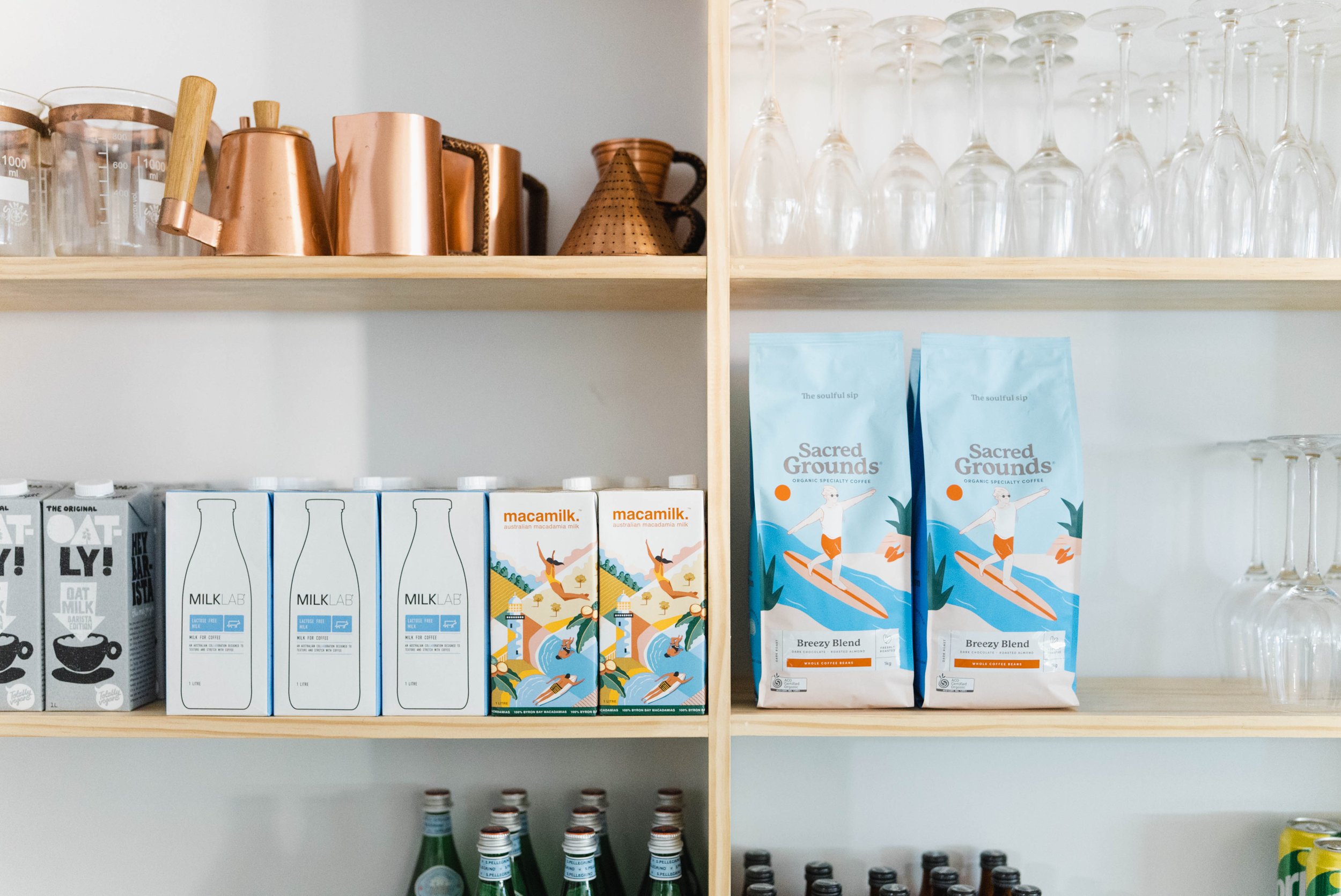
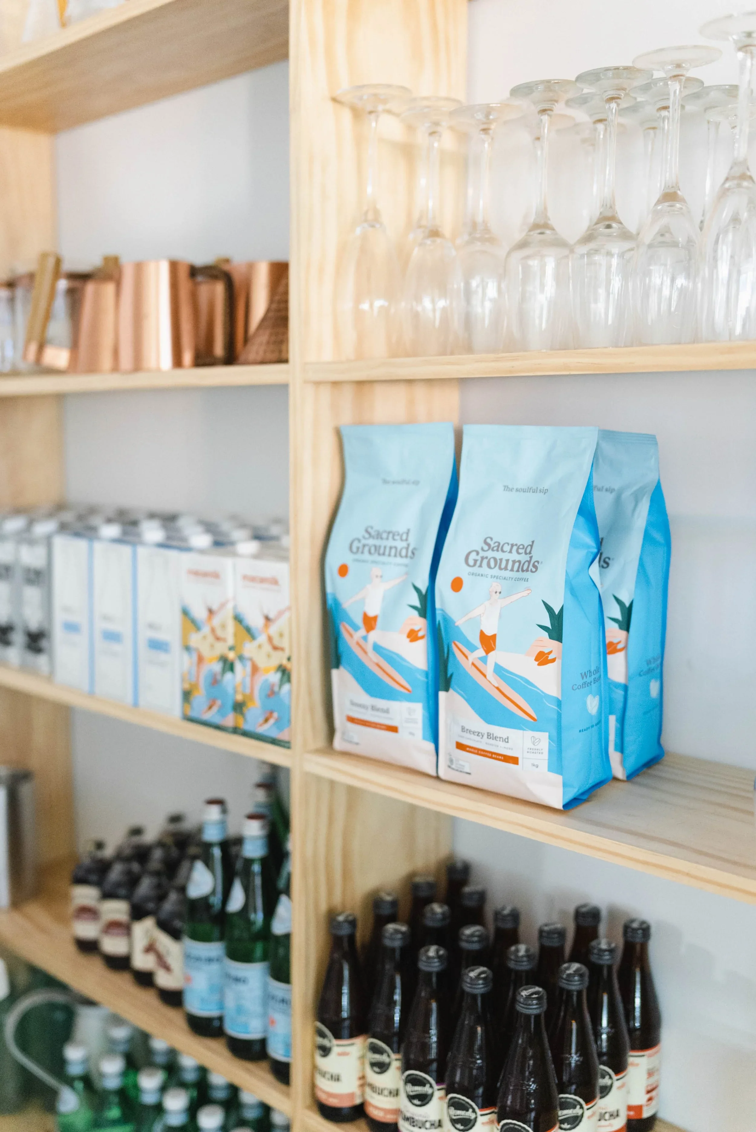
We killed the brown tree.
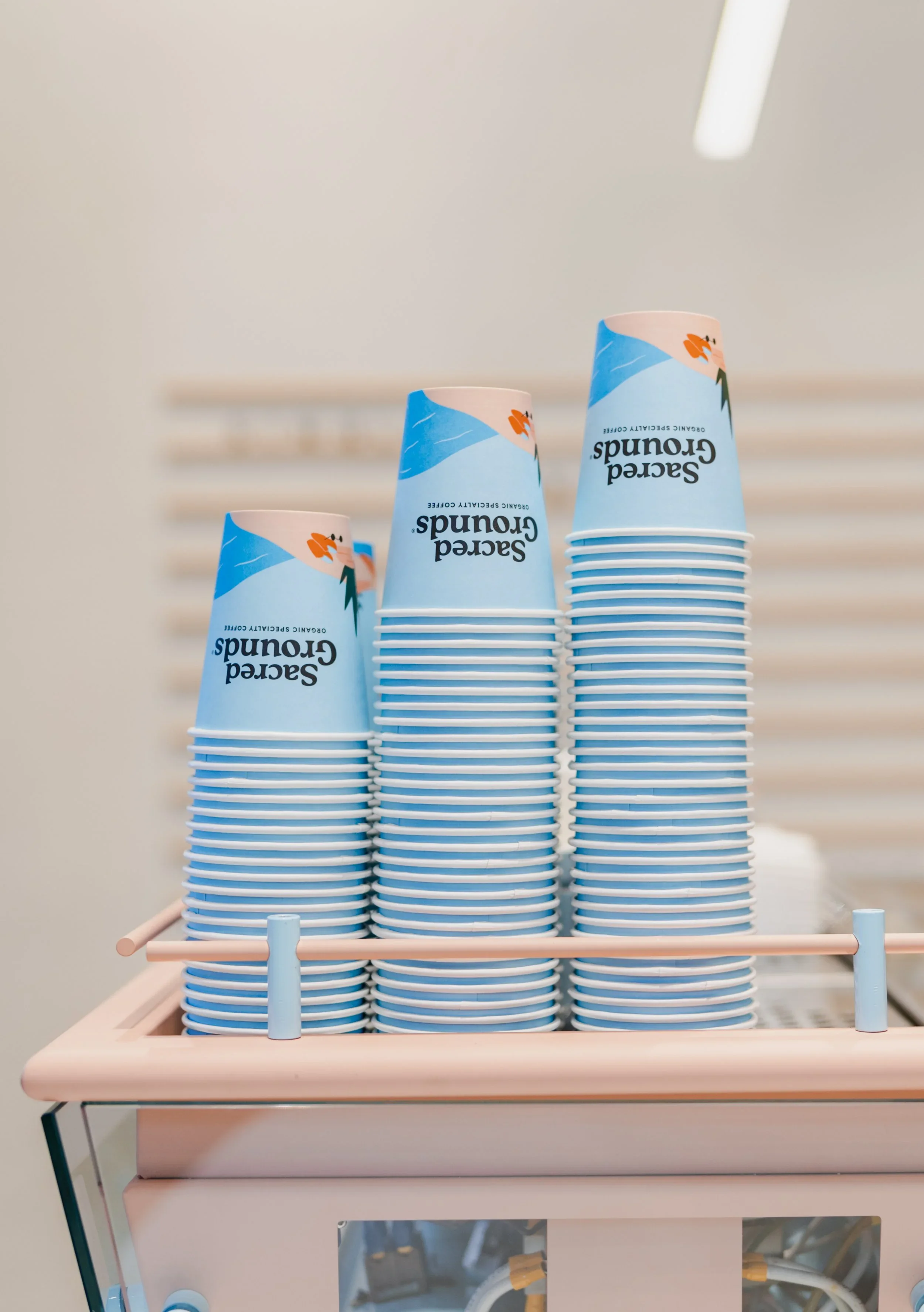
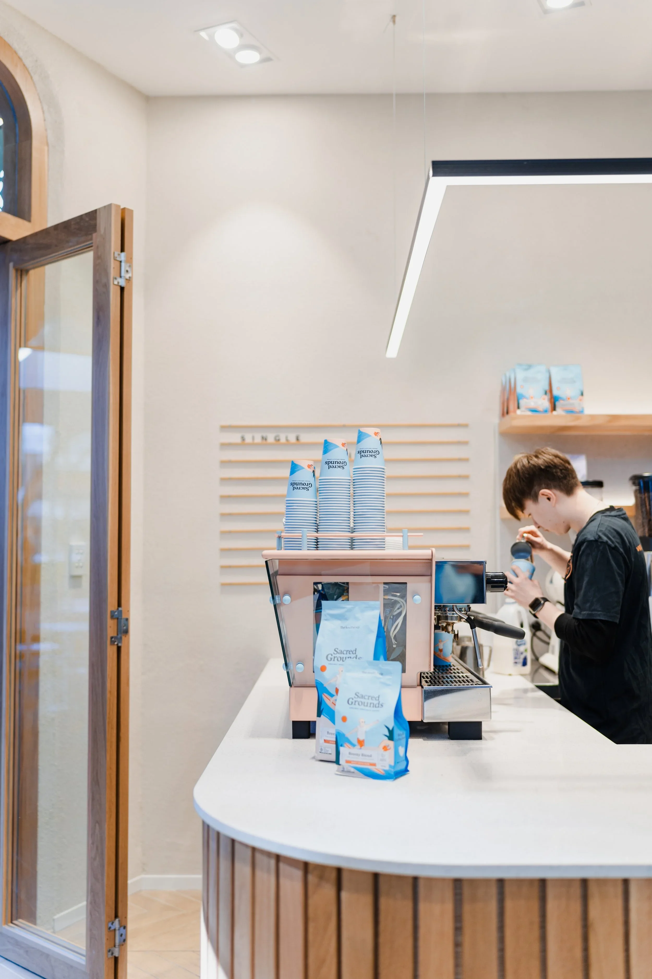
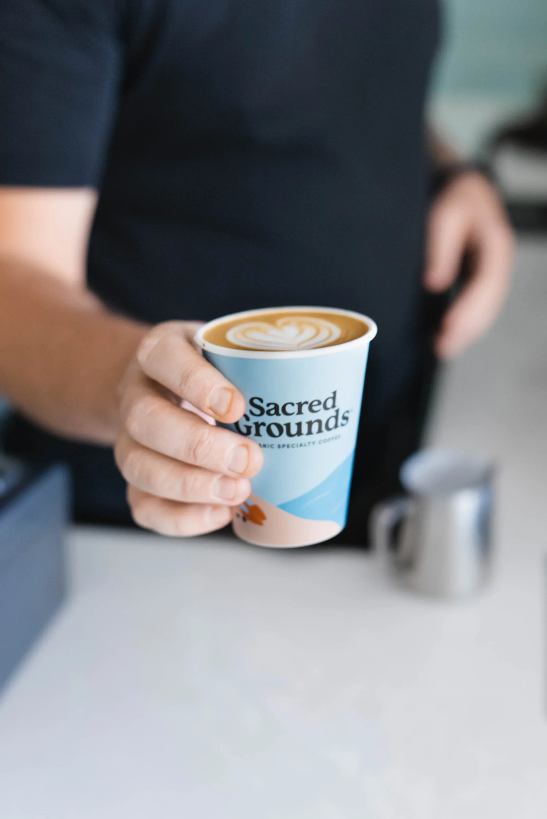
In its place came bold, bright pastel packaging that cut clean through a sea of dark bags and sameness. It was a first for supermarket coffee — unapologetically colourful, human, and designed to be noticed from five metres away. The pack wasn’t just a container; it was the brand.
Anchored by the “Do Your Thing” motto, Sacred Grounds shifted the conversation away from tasting notes and origin jargon and toward identity and self-expression. This was coffee for real life — creative, independent, and unconcerned with coffee snobbery.
The result was a hugely successful brand relaunch, built on clear differentiation and fearless visual thinking. Sacred Grounds owned its lane by focusing on how people feel, not what’s in the cup. Packaging became the hero platform, carrying lifestyle, personality, and purpose straight onto shelf.
It’s a case study in how brave creative decisions — backed by strategy — can turn an overlooked product into a standout brand.